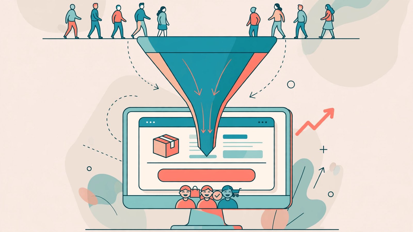
You can double your advertising budget, or you can fix the page your ads send people to. The second option is usually cheaper and far more effective. A landing page has one job: turn a visitor into a lead, a customer, or a subscriber. Yet most fail at that job for simple, fixable reasons — a vague headline, too many distractions, or a form that asks for too much, too soon.
This guide covers what actually makes a landing page convert: the design principles, the copy structure, and the testing habits that separate pages that waste traffic from pages that grow a business. You can apply most of it to a page you already have.
What Is a Landing Page, and How Is It Different From a Homepage?
A landing page is a standalone page built for one campaign and one action. Someone clicks an ad, an email link, or a social media post and arrives on a page that speaks directly to what they clicked. A homepage, by contrast, serves everyone at once: it introduces your business and tries to satisfy visitors with very different needs.
That focus is the whole point. On a general homepage, visitors have to hunt for the offer that interested them, and every extra click costs you conversions. A good landing page removes the hunt: the promise in the ad matches the headline on the page, the content supports that promise, and there is one clear next step.
Start With One Goal and One Audience
Before you design anything, write down two things: the single action you want visitors to take, and exactly who those visitors are. Book a consultation, download a guide, start a free trial, buy one product — pick one. Pages that ask visitors to subscribe, follow, book, and buy at the same time usually achieve none of them, because each competing option weakens the others.
Knowing your audience shapes everything else. Write down the problem your visitor is trying to solve, what they have probably tried already, and what would stop them from trusting you. Your copy will answer those concerns.
Design Principles That Support Conversion
Keep the layout clean and focused
Remove the standard website navigation, or reduce it to the minimum — it invites visitors to wander away before they act. Use plenty of white space, one clear reading path from headline to call to action, and sections that build the case in order: problem, solution, proof, offer, action.
Make the call to action impossible to miss
Your call-to-action button should stand out through contrast, not clutter. Use a colour that differs from the rest of the page, make the button large enough to tap easily on a phone, and repeat it after major sections so visitors never have to scroll hunting for it. Keep the area around the button free of competing links.
Design for mobile first
For most businesses, most landing page traffic now arrives on phones. A page that forces mobile visitors to pinch, zoom, and scroll sideways will lose them in seconds. Test every page on a real phone: text readable without zooming, thumb-sized buttons, forms that are effortless to complete.
Writing Copy That Persuades
Lead with a headline that states the benefit
Your headline is the most-read words on the page, and visitors decide within seconds whether to stay. A strong headline states the outcome the visitor wants, in their language, and matches the promise that brought them there. Compare a weak headline like “Welcome to Our Accounting Software” with a stronger one: “Send Invoices in Minutes and Get Paid Faster.” The second names a benefit, a timeframe, and a result.
Add a short subheadline underneath that explains how it works or who it is for, then place your call to action immediately below. A visitor who reads nothing else should still understand the offer.
Sell benefits, then back them with features
People do not buy features; they buy what features do for them. “Automated backups” is a feature. “Never lose a customer file again” is a benefit. List three to five key benefits as short bullet points, each tied to a problem your audience recognises, and mention technical features afterwards as supporting evidence.
Handle objections directly
Every visitor arrives with doubts: Is it too expensive? Will it work for someone like me? What if I regret it? Name those doubts and answer them. Money-back guarantees, free trials, no-contract terms, and clear pricing all reduce perceived risk — and a short question-and-answer section can resolve concerns that otherwise send people away to think it over, and never return.
Use social proof that feels real
Testimonials, reviews, client logos, and numbers (“trusted by 2,000 small businesses”) reassure visitors that others have taken this step safely. Specific proof beats generic praise: a testimonial with a name, a role, and a measurable result is far more convincing than “Great service!” from an anonymous customer. If you are just starting out, use what you honestly have — early feedback, credentials, guarantees — and never invent testimonials.
Forms and Calls to Action: Ask for the Right Amount
Every field you add to a form lowers completion rates. Ask only for what you need for the next step: for a free guide, a name and an email address are enough. Save detailed questions for later, when trust is higher. Button text matters too — “Submit” says nothing, while “Get My Free Guide” or “Start My Trial” describes what happens next. Below the button, a short reassurance line — “Free, no card required” — removes last-second hesitation.
Test, Measure, and Improve
Run one A/B test at a time
First, know your baseline: your conversion rate is conversions divided by visitors, so if 1,000 people visit and 40 sign up, your rate is 4 percent. Then A/B test: show half your visitors version A and half version B, changing only one element — the headline, the button text, the image, or the form length — and measure which converts better. Changing five things at once tells you nothing, because you cannot know which change caused the result.
Start with the highest-impact elements: the headline, the main image, the call-to-action text, and the offer itself. Let each test run until you have enough conversions to trust the result; a handful of visitors proves nothing. Small lifts compound: improving from 3 percent to 4 percent conversion means a third more leads from the same traffic and the same advertising spend.
A simple testing routine
- Step 1: Pick one weakness — the element you suspect most of costing conversions.
- Step 2: Write a clear prediction, such as “a benefit-led headline will beat the current one.”
- Step 3: Build version B, changing only that element, and split your traffic evenly.
- Step 4: Run the test until you have a meaningful number of conversions, then pick the winner.
- Step 5: Record what you learned, keep the winner, and move to the next test.
Common Landing Page Mistakes to Avoid
- Sending ad traffic to your homepage, where the specific offer gets lost among everything else you do.
- A headline that does not match the ad, so visitors feel they have arrived in the wrong place.
- Walls of text with no structure, no subheadings, and no bullet points for scanners to grab onto.
- Hidden pricing and vague promises, which create suspicion rather than curiosity.
- Testing nothing, then redesigning the whole page on opinion every few months.
Frequently Asked Questions
How long should a landing page be?
As long as it needs to be, and no longer. A simple free offer may need only a headline, a few benefits, proof, and a form. An expensive or complex offer needs more explanation, more proof, and more objection-handling. Match the length to the size of the decision you are asking for.
What is a good conversion rate for a landing page?
It varies widely by industry, offer, and traffic source, so treat published averages with caution. A free, low-commitment offer should convert far better than a request to book a sales call. Your best benchmark is your own previous performance: aim to beat it steadily, test by test.
How many A/B tests should I run?
Run them continuously, one at a time, for as long as the page receives meaningful traffic. Testing is not a one-off project; it is a habit. Even one test a month produces steady, compounding improvements over a year.
Conclusion
High-converting landing pages are not magic, and rarely the result of one clever trick. They come from focus: one audience, one goal, a headline that states a real benefit, copy that answers doubts, honest proof, a lean form, and a habit of testing one change at a time. Start with the page that receives your most valuable traffic, apply the fixes in this guide, and measure what happens.
Want more guides on turning visitors into customers? Subscribe to Go Digital Professional for new articles on web design, e-commerce, and digital growth, straight to your inbox.